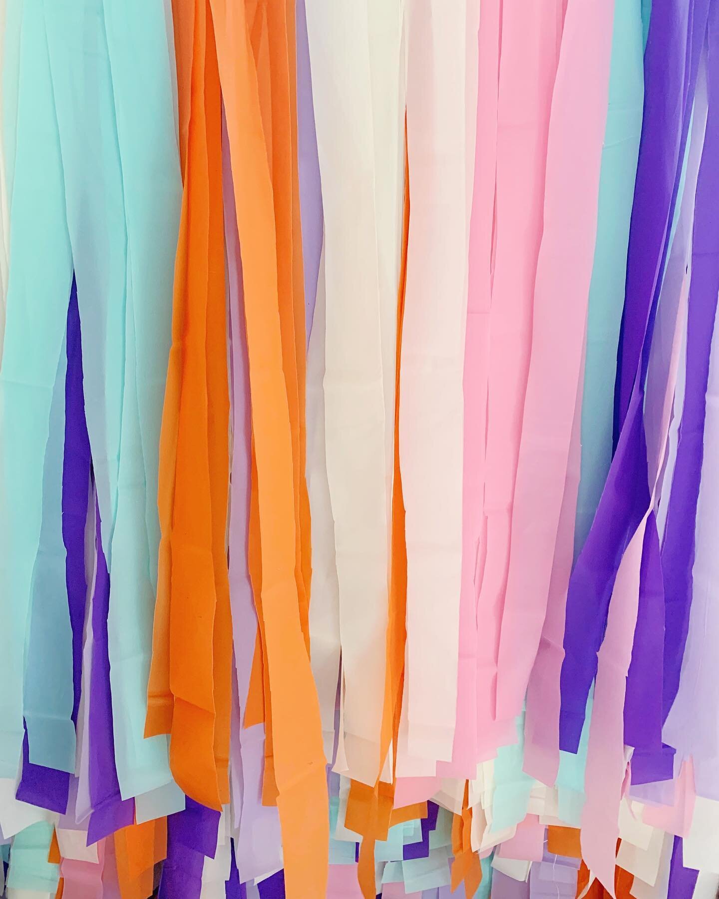
COLORFUL :
FULL OF INTEREST; LIVELY AND EXCITING; BRIGHT.
MINIMALISM :
CHARACTERIZED BY SIMPLICITY.
I'm a bit of a contradiction when it comes to style and design.
I love Modern architecture AND Victorian era architecture, all white everything AND bright colors, Cary Grant AND Tom Petty, clean simple lines AND texture, a glass of wine at an art gallery opening AND dancing in the lawn at a Classic Rock concert, minimal type AND retro funky graphics... hence the name - The Classy Hippie.
Juxtaposition and Contrast are my jam.
So, when I discovered Emmanuelle Moureaux's work last week - I was in love. Ever since adopting minimalism myself, I've gotten rid of A LOT of color and taken it back to the basics [black, white and gray.] But, since doing so, I've really missed color in my life.
I don't regret nearly getting rid of all color in my life, because before - it was all just a jumbled mess. By taking it back to B&W and slowly reintroducing color, I've established what is necessary and basic to my lifestyle // design style and now I can strategically start adding bits of color that I love and that bring value to my life, home & work.
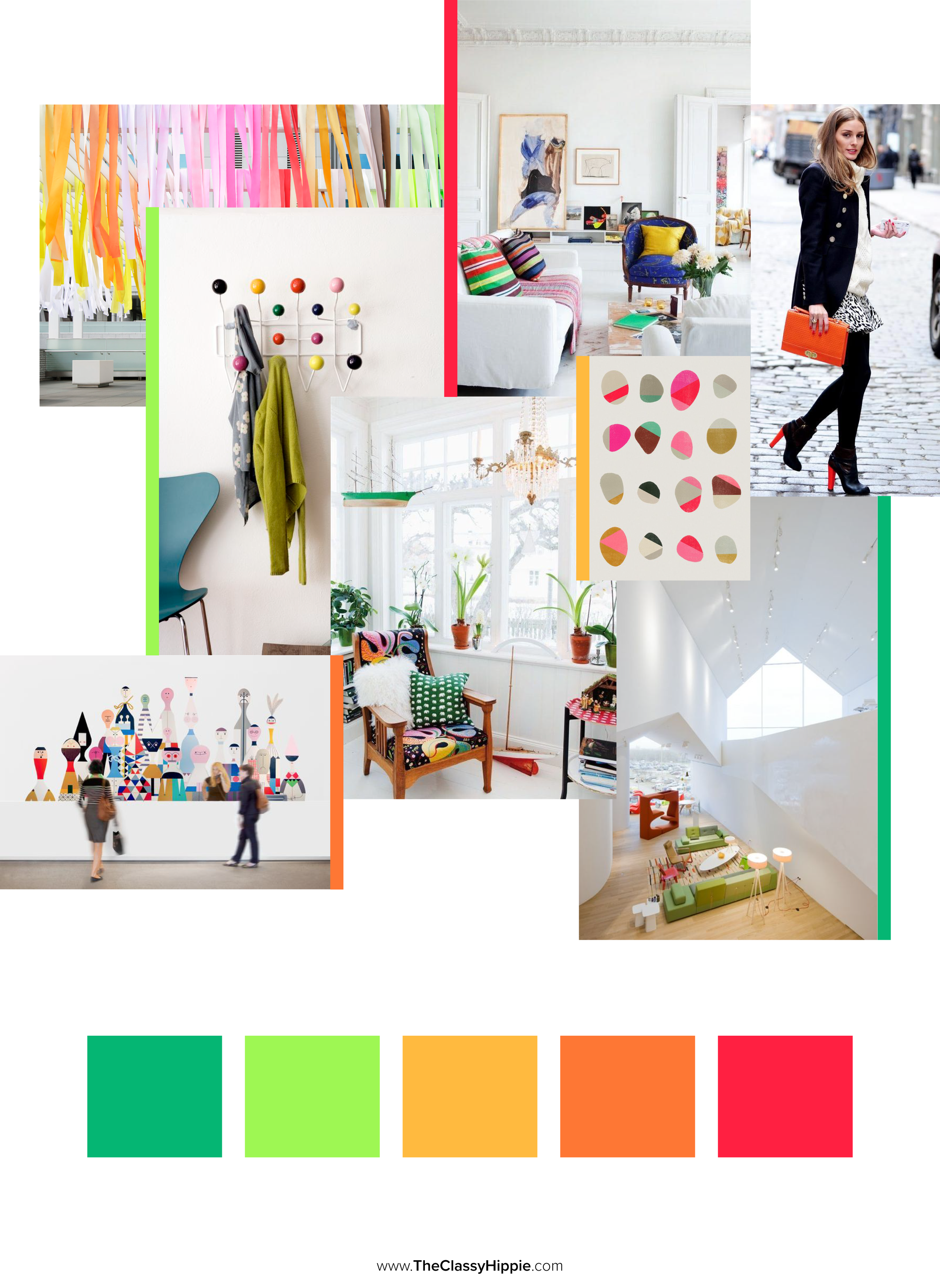
That's what I love about Colorful Minimalism. It's still clean & simple but also bright & lively, which is something a lot of minimal designs get criticized for NOT being. Emmanuelle's work is the manifestation of that perfect balance, harmoniously living in both worlds.
This particular color palette and style is PERFECT for a future and long-term devotion of mine - UGH - I can't wait to share, but it's still way too soon right now.
Until then, be sure and catch up on any past Color Stories you may have missed below.
Love & Blessings,
Genevieve




This week's Color Story is dedicated to one of my Best Friends, my Shnookums, Natalie! Today is her birthday and when I think of her I think of a bubbly, goofy, loving, silly, loyal and sunshine-y lady - it's one of the reasons I call her my Sunshine - no really, I do.