It's time to get physical - physical and take your branding beyond paper. Beyond the business card. Beyond the logo...
In this day and age, the age of Instagram, there are two VERY important ways you can carry your brand throughout your customer experience that you might have overlooked - The Mural & The Decor // Interiors.
I want to focus on these two ways in particular because they are quickly becoming the business card of our time. Beyond having a great product or service, if you get these two right, your customer will be loyal and do all of your marketing for you.
The Mural
If you have a physical location for your business, one of the best things you can do in terms of branding and design is to have a mural. People LOVE taking pictures in front of murals. They come to your business, see the mural, pose in front, snap a pic and post it online. Then their friends see it, don't want to miss out, want to try out the cool looking new place their friend just went to, want to also take a picture in front of the mural, come to your business - and the cycle continues.
The best murals, IMO, aren't of a logo. Painting your logo on the side of a building or on a wall is fine - but that's more of a sign and less of a mural. Hiring an artist to create a custom piece that fits your brand is a much better way to go.
Take a look below at just a few people // businesses doing it right.
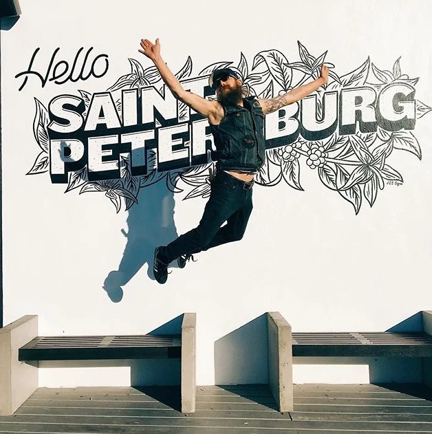
Bandit Coffee Co. // St. Petersburg, FL
I found out about Bandit Coffee Co. because The Minimalists are partial owners and they bring it up every once in a while on their podcast. One day, Josh was talking to Ryan about how he kept bringing up that the mural needed to be completed to the folks running the shop day-to-day.
He joked about the fact that they had a lot on their plate and were putting their attention on running the business, so he understood why they had different priorities at the time - but that he was itching for it to get done. After the mural was completed, Ryan visited and brought up the fact that every single person he saw was taking pictures...
PHOTO SOURCES // 01 // 02 // 03 // 04 // 05 // 06 <-- The Bandit Crew
Three Brothers Coffee // Nashville, TN
I mean, have you even been to Nashville if you haven't taken a picture in this alley? While looking through the MANY photos taken here, I found everything from simple shots of coffee from locals and out-of-towners to models, bloggers, newly engaged couples and businesses using it for their own marketing campaigns - taking advantage of this cool backdrop.
I haven't been to Nashville yet, but now when I go, I don't need to look up where a good cup of coffee is thanks to this sweet alley way. I've seen it enough to know that I too want to take a picture there and, you know, get some coffee.
PHOTO SOURCES // 01 // 02 // 03 // 04 // 05 // 06
Two Scoops Creamery // Charlotte, NC
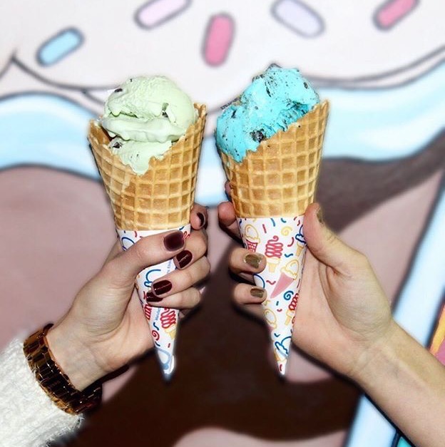
The minute this place opened, Instagram was flooded with scoops on scoops taken in front of their awesome, wonky & fun mural located inside of their building.
Anyone not wanting to experience the dreaded #FOMO quickly made their way to the new, and I must say, DELICIOUS ice cream shop - including myself. [Picture 01 is me below.]
PHOTO SOURCES // 01 // 02 // 03 // 04 // 05 // 06
King of Pops // Charlotte, NC
Another Charlotte staple - especially in the summertime. King of Pops continued their fun, cheery & bright brand by painting the interior of their shop [as well as their patio, not pictured] with bold & colorful patterns.
Again - locals, bloggers and businesses alike have used these brightly colored stripes in their own personal feeds as well as in their business feeds for marketing campaigns.
The Decor // Interiors
Ok. So you have a mural on the inside or outside of your building - now what? Have you ever been in an office building and remembered what it looked like or how it made you feel? Never? Maybe a few times? Why is that?
People like being in well-designed spaces. They like being surrounded by beautiful things - that's what makes them remember a space and, often, that's what gets them in the door. Once they're there it's up to your service or product to keep them coming back - but getting them there is up to beautiful design that then lends itself to great marketing.
Choosing the right paint colors, tile, signage, lighting, textiles, etc. matters!
The folks below get it.
Not Just Coffee // CHARLOTTE, NC
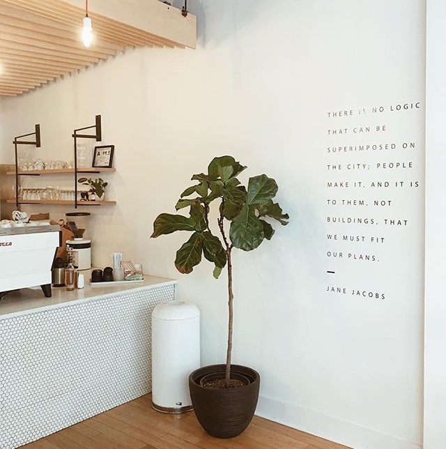
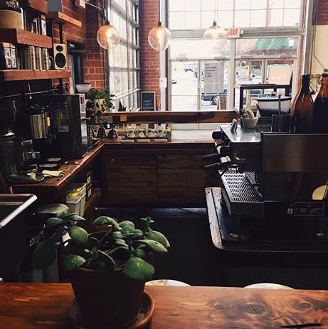
Not only is NJC arguably the BEST coffee in Charlotte - but they completely get design // branding - especially when it comes to their interiors. Their minimal, clean, artisanal aesthetic lets you know that they're serious about their coffee and they take pride in their craft.
The fact that they don't settle is written all over every design decision and element. They want their customers to enjoy a well-crafted cup of coffee in a simple and relaxed environment and because it's absolutely beautiful - their customers let all of their friends know where they get their coffee!
PHOTO SOURCES // 01 // 02 // 03 // 04 // 05 // 06 // 07 // 08 // 09
Hygge Coworking // CHARLOTTE, NC
Hygge is a coworking space in Charlotte. Their tagline is - Our name is hard but our space is easy. I'd say they're known for their community engagement and positive energy which is expressed in every inch of their branding - down to their coffee mugs.
The yellow shouts positivity, while the black, white and gray neutrals offer a more serious tone keeping the yellow from becoming overwhelming - as if to say, "We want to make the world a better place and we know it's going to take a lot of work." The overall look is fun and engaging yet simple, clean and easy.
The welcome signs, quote graphics and conversation areas throughout the space sends a message of inclusivity, positive impact, community engagement and hard work.
PHOTO SOURCES // 01 // 02 // 03 // 04 // 05 // 06 // 07 // 08 // 09
Free Range Brewery // CHARLOTTE, NC
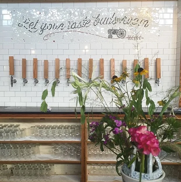
Not only does Free Range have delicious beers, but IMO it's the best branded and designed Brewery in Charlotte, out of all of the ones I've been to so far.
The branding was done by Rachel Martin - a very talented local designer - who is also a partner in Free Range, so she definitely had a connection to the design and carried it out flawlessly.
From the tractor parked outside to the beautiful mural and mosaic behind the bar - everything has been thought of. This place is a family hangout, which means you can bring the kids and not feel even a little bit bad about it. That message is carried through the use of colorful classroom chairs and repurposed bus seats as well as the bookcase full of board games.
The whimsical, fresh yet home-y and rustic feel the design gives off perfectly matches and compliments the brand. Well done!
Branding goes A LOT further than simply designing a logo - it's all encompassing - holistic. Every aspect of design and customer experience tells a story about who you are, what you believe in, what kind of work you do, if you cut corners, who you want to work with, who you serve and so on and so on.
What are some ways you can start upping your branding game in your physical space? Got some beautifully designed businesses you love to frequent? Share them below!
Love & Blessings,
Genevieve
P.S. Want my help in taking your brand up a notch? Check out my design services here.
P.P.S. Want to start at the beginning? Visit my Start Here page.


